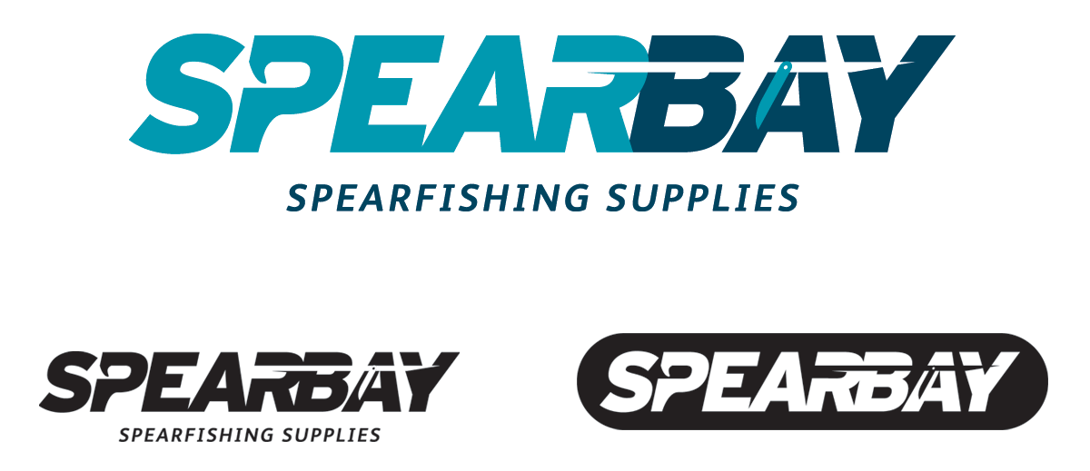
Spearbay are a new online start-up business based in Penzance. They contacted Carta for help with their company logo design. We worked together to develop an identity that would compete in the fishing industry with it’s competitors. The identity needed to be simple, bold and have an element of ‘does what it says on the tin’ to explain itself visually. Using the negative space created by the font and the ‘P’ as grip and trigger, we were able to subtly incorporate a speargun silhouette into the company name. The logo also needed to be used in various marketing situation from embroidery to stickers in solid, negative, colour and monotone configurations. www.spearbay.co.uk

