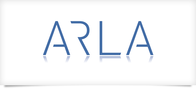
Logo design for kitchen and bathroom designers ARLA Design. The brief was very open apart from a modern clean feel. I used a font called DIN as the basis for the wording and then set about modifying it. I wanted the letters sit next to one another without any jarring angles. By cutting away the left part of the ‘R’ it now follows the shape of the ‘A’. The ‘R’ can still be read without it’s left side and allows the ‘A’ to move in closer. The end of the ‘L’ had the same treatment. Finally, cutting away part of each ‘A’ gives the overall word a more open feel. I have also produced ARLA’s stationery, marketing material and website.

